

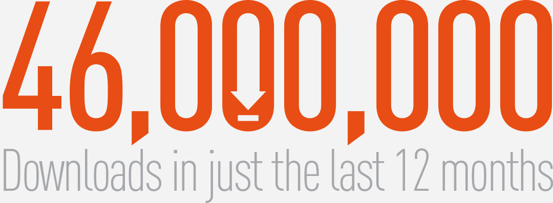
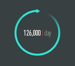
How We Access The Web
With the recent changes in PC vs. tablet sales showing the huge shift toward portable devices, websites are being accessed more and more by smaller screened mobile products such as the iPad, Kindle and Nexus tablets as well as a few billion smart phones. Therefore, people searching for services and products are no longer bound to their desktop PC’s. Instead, through 3G, 4G and wifi connections, they can get instant information on just about anything.
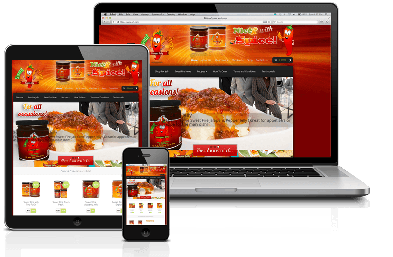
A Single Fully-Responsive Website
As mobile technology was emerging, many website owners were forced to have multiple versions of their site. One for standard PC access, the other for mobile access. Now, with the use of fully-responsive coding practices, one site is all that’s needed. If done properly, fully-responsive technology will automatically adapt the website to your device’s screen size and resolution regardless if it’s a tablet, smart phone or PC.
- Web 98%
- iOS Devices 31%
- Android 30%
- Android Tablets 18%
- Desktop App 12%


A Look Into the Future
WordPress 3.8
WordPress Three.8 Lorem ipsum dolor sit amet, consectetur adipiscing elit. Sed sed varius orci. In nulla ante, adipiscing ut nisi a, tristique tristique elit. Duis vel lacus nec arcu volutpat aliquet quis ac eros. In ac risus non magna pulvinar placerat sit amet eu mi. Integer so
WordPress 3.9
WordPress 4.0
WordPress Four.0 Lorem ipsum dolor sit amet, consectetur adipiscing elit. Sed sed varius orci. In nulla ante, adipiscing ut nisi a, tristique tristique elit. Duis vel lacus nec arcu volutpat aliquet quis ac eros. In ac risus non magna pulvinar placerat sit amet eu mi. Integer so